Multidimensional Analysis
One of the tools available in the YourCX panel to support advanced data exploration is Multidimensional Analysis. It allows you to run comparative observations across your collected data by cross-referencing multiple criteria—based on survey responses, as well as contextual or technical metadata.
You can also incorporate internal partner segments, such as customer type, customer tenure, or delivery method—any data that supports meaningful cohort building.
The analysis is powered by a pivot table, where you can freely select and combine any parameters collected within your study.
Example Analysis
Let’s imagine you're conducting satisfaction surveys across 100 physical store locations. In each store, you use a single survey to measure the NPS (Net Promoter Score). Additionally, contextual data—such as which specific store each respondent visited—is automatically collected.
The Multidimensional Analysis tool is perfect for tracking how customer experiences evolve across offline locations. To examine how NPS scores have changed over the past year for each store, simply segment the data by store and by month.
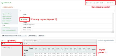
Here’s how:
Go to the Multidimensional Analysis tool.
In the calendar, select your desired time range (e.g., the last 12 months).
Expand the list of available segments and check the boxes for:
the NPS question (e.g., “How likely are you to recommend…”),
Store – name (the contextual info showing store location),
Time – month (to analyze month-over-month changes).
Click Apply and wait for the data to load. (For large datasets and long time ranges, this may take a few minutes—please be patient.)
Use drag & drop to add segments to the pivot table as shown in the example below:
Place stores in the left column,
Place months in the top row.
In the data display selector at the bottom, choose NPS as the presentation method.
Done! Your customized view will display the insights you need.
Multidimensional Analysis Capabilities
YourCX's multidimensional analysis allows for flexible and detailed data exploration across multiple dimensions. Key features include:
Organizing data across multiple dimensions (simultaneously):
In the example screenshot:
Rows display the “Quarter” dimension (e.g., 2024-01-01, 2024-04-01, etc.),
Columns show responses to the question “What is the purpose of your visit?” (e.g., “Looking for CX-related content”, “Logging into the panel”, etc.),
Values (cells) display the number of responses in each category.
Combining survey questions and metadata:
Any survey question or metadata (e.g., date, location, channel, user type) can serve as a dimension in the pivot table.
This allows you to quickly switch between different views and perspectives.
You can analyze multiple questions at once (e.g., “How satisfied are you overall?” and “Purpose of visit”) and view how responses distribute across different quarters or time periods.
Selectable metrics:
Rows and columns can show not only raw counts but also other metrics like averages, totals, or percentages.
In satisfaction studies, it’s especially useful to view metrics such as average ratings, NPS, or total number of responses.
Dynamic filtering and drill-down capabilities:
Apply filters (e.g., only new customers, or only a specific contact channel) and see how response structures change.
Start with a high-level overview, then drill down into specific subgroups within the same pivot table.
Multi-level grouping:
Pivot tables support nested dimensions—for example:
Rows can be grouped first by quarter, then by contact channel within each quarter.
Columns can be split by visit purpose.
This gives you a complete picture in a single report, showing how visit purposes vary by time period and contact method.
Percentage vs. absolute values:
It’s often useful to display both the number of responses and their percentage share.
Depending on your pivot table settings, you can choose whether to show data as “% by row,” “% by column,” or as raw values.