Report Generator: Step by Step
Using the report generator, you can create a structured summary of survey results—with charts and descriptions divided into slides. The tool allows you to define the most important filters and segmentations to use when selecting the data slices you are interested in. You can then reuse these to generate a new data set for a different time period or a new question. This process is reduced to just a few clicks.
To create a new report or edit an existing one, log in to the YourCX panel. You will access the homepage with a view of active surveys, from which navigate to the Reports tab located in the left-hand menu. This is your workspace for report creation. You create reports using the “Add Template” option available in the report generator. Within the template, you work on data and its analysis, and once completed, you can generate the report. You can also pause editing and return to it at any time.
Analyses developed in the template are available under the Generated Reports tab. They can be exported as raw data in JSON or Excel formats, or as PDF reports with visualized results.
Getting Started with a Report
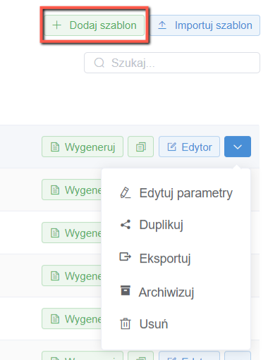
To create a new report, use the Add Template option located at the top right of the screen. When creating a new report, you can also use the Duplicate option available by clicking the arrow next to the editor. This allows you to reuse data sets already generated for another report, for example, by setting a new time range, adding filters, or changing the questions referenced. You can also edit parameters of an existing report, export it, archive it, or delete it.
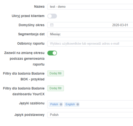
When creating a template, enter the basic report details, including:
– Name;
– Default data analysis period (as needed at the moment);
– Date segmentation (division by days, weeks, or months);
– Survey (you can create reports for any of the surveys available in your panel);
– Report recipients (the completed report will be sent to all specified individuals);
– Allow period modification during report generation (lock the period for which the report was prepared);
– Surveys (from the list of available surveys, select only those for which you want to generate a report);
– Survey order (after selecting the appropriate surveys, you can set their order in the report);
– Filters for the survey (to limit the data scope);
– Template language;
– Base language.
After selecting the survey for which the report is to be generated, a convenient solution is to set up automatic generation of preliminary slide headings, question text, samples, and charts for standard data sets.
This allows you to create the basic report much faster. You can do this using an option available at the bottom of the template creator. It allows you to specify elements that should be automatically placed on all slides. You can also create an "empty" template and start building the report from scratch. Simply, in the template creator, do not select the name of the survey. You can do this later when creating individual slides. However, this option requires the ability to independently create data sets and their visualizations. Therefore, familiarize yourself with the full content of this guide to better understand its capabilities in constructing the visual aspect of the report.
Slide Editor – Basics
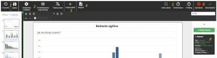
After accepting the template settings, you will return to the report list view. To start editing it, click on the editor next to the name of the report template you just created. This will open the editor. Let's go through the elements visible on its main screen one by one:
The Restore option allows you to revert to a previous version of the report. This feature is useful, for example, in cases of errors caused by incorrect data set programming. The Save option applies all recent changes, while still allowing you to restore the report to an earlier version prior to saving.
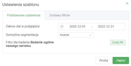
Remember: although the report generator has an auto-save function, it is recommended to save your work regularly to ensure your progress is not lost.In the Template Settings, you can change the date range and the default data segmentation method that were set in the template creator. Additionally, you can apply filters that will be used in the report or create filter sets to use on selected slides.
 Predefined segmentation allows you to set a set of segments that can be used in any data set within the report. However, for proper use of this function, it is recommended to first independently configure segments within individual data sets.
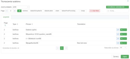
Translations is the place where you can automatically or manually translate the entire report into any language — this functionality is integrated with DeepL.
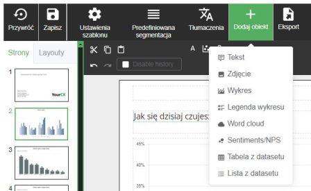
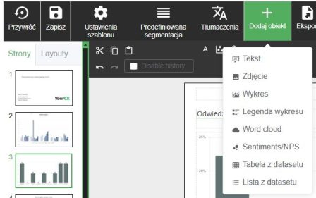
- The third group of "Add Object" icons is used to insert new visual elements onto the slide, including:
Text: a text box that allows adding descriptions to charts or tables, as well as titling the slide.
Image: a photo or other graphic file stored in the image library (you can easily upload it by dragging and dropping or selecting the file).
Chart: a chart displaying survey results.
Chart Legend: allows generating a custom legend for charts.
Word Cloud: inserts an area for a word cloud that visualizes data analysis from open-ended responses.
Sentiments/NPS: enables inserting a chart illustrating sentiments or NPS scores.
Dataset Table: a table based on a data set.
Dataset List: a list from a data set (most often a list of categories for open-ended responses).
- The Export button allows exporting the report to a selected data format (e.g., .xlsx, .pdf, .pptx).
- The Full Screen option displays the report editor in full browser window mode.
- In the top right corner, there are icons. The first one, Questions, allows you to easily see which survey questions are on each slide and (for larger reports) ensure that every question is analyzed in the report.
The next icon informs about errors in the report template. These can result from improperly programmed data sets or inconsistencies in the results. If you cannot resolve them, you can restore the report to its state before the error occurred (using the Restore option).
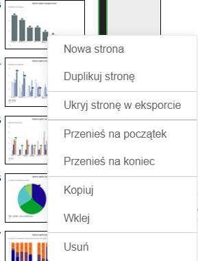
On the left side, there is a list of slides included in the report. You can reorder slides by dragging and dropping them with your mouse. By right-clicking on a slide, you will see more options:
New Page (creates an empty slide);
Duplicate Page (copies an existing slide along with its assigned data sets and visual elements);
Hide in Export (allows hiding a slide in the exported file);
Move to Beginning/End;
Copy/Paste/Delete.
Slides can also be duplicated—both within a report and between two open reports (in another window or browser tab). The easiest way to do this is by using copy/paste.
- On the right side, there is a list of ready-made data sets (datasets). For each slide, data sets are defined separately. Data sets can also be copied, duplicated, or deleted—simply right-click on them to access a dropdown menu. This menu also allows you to create a new data set. Data sets can be created based on other datasets already created for the given slide.
Note: Data sets can be copied within the report between slides.
Defining Data Sets (Datasets)
The starting point for analyzing survey data is proper data preparation, which means defining datasets. It is from these datasets that information is drawn to create tables, charts, or lists of open-ended responses. Within a dataset, you specify the question you want to work on and develop analyses—selecting segments, recalculating data, or applying filters.
A new report template will automatically include basic datasets based on the surveys selected during its creation. Automatically generated datasets can be left unchanged or edited to achieve the desired data structure. In the latter case, operations on datasets are key.
Adding a dataset is done by clicking the Add Dataset button. Clicking the icon representing a dataset allows you to enter its editing mode.
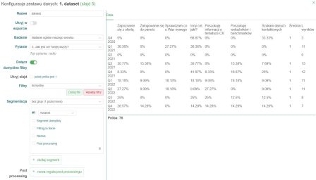
Name: Give a short, intuitive name (without spaces or Polish characters) that will allow you to identify the specific data set during other actions on the report, such as creating histograms (charts), where you select the data set from which you are retrieving data.
Enabling the Hide in Export option will exclude this dataset from the data export to the xlsx format. For example, if there are three datasets on a slide, of which only dataset no. 3 (based on the first two datasets) is important, then we are only interested in the last one, and the unnecessary ones can be hidden. However, this does not affect the appearance of the report in PDF format.
Survey: Select the survey on which the data set is to be based.
Question: Select the question that will be the basis for the data in the dataset.
Include default filters: This option is enabled by default and means that the dataset uses filters applied to the entire report.
Hide slide if <: this option allows you to quickly hide the entire slide if the sample size is not what it should be according to the researcher preparing the report.
Filters: When preparing an analysis, depending on its purpose, you can apply a filter to the data sets that selects data that meets a specific condition. This allows you to present the survey results, for example, for users of mobile devices, a specific type of user (e.g., new or returning users), or the type of source of entry to the site (e.g., only users from paid channels). The filter can also be an answer to any other question in the survey. Available options are obtained by clicking on the Add Filter option.
Segmentation allows you to divide the results using a selected context. For example, when you select "Mobile/Desktop" from the dropdown list, the results will be divided into 2 rows, one will contain the results of respondents using mobile devices, and the other those using computers. In addition, shortcuts to predefined segmentation are available at the top of the list (thanks to this, we can set our own type of segmentation, e.g. one that will display data for the previous and current period, and use it in any data set by selecting its name from the list).
By default, the segmentation "without groups (1 level)" is selected, but we can switch it to "with groups (2 levels)", which can be useful to separate the results for respondents divided according to different criteria, e.g. into age groups (group name: "Age") and gender (group name "Gender"). This is especially useful for visualizing results, e.g. on a chart. As a result of this setting, in the table with results, the first column will contain the name of the group (e.g. age), and the second the effect of the selected segmentation (e.g. age groups). For each of the segments, you can perform certain operations on its rows - e.g. hide, rename or sort by name or value. This is done using the Post Processing option assigned to the given segmentation.
New Post Processing rules can also be applied to the entire dataset. However, they refer not only to rows but also to columns. This gives a greater range of possibilities for defining conditions for displaying, sorting and filtering data. Thanks to this option, you can easily change the names of rows or columns to make them more accessible, you can also hide a given variable that is not important at a given moment, you can swap rows with columns and set the order of rows/columns. All the possibilities unfold after clicking on "+ New post processing rule".
After entering the settings, we save them by clicking the Save & Reload button (at the bottom on the right). The dataset editor will apply the entered settings and display the current result in a table. If there are no errors and the result obtained is as intended, you can close the dataset window.
If you are using the report generator to generate raw data in .xlsx format, all you need to do is prepare datasets for this and subsequent slides, or you can immediately export the data, which will automatically appear after creating the report.
Developing the Visual Layer of the Report
After defining the data, you need to choose how the data is to be presented. To add a particular object, select the "plus" sign in the top menu, which, when expanded, allows you to select particular elements.
After clicking on "Chart," a new object should appear on the slide that can be linked to a created dataset, enabling visualization of the survey results. Double-clicking the chart object on the slide will open its editor:
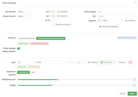
1. Chart Settings:
Chart Type:
The user can select the type of chart (e.g., "bar-line" – a combination of bar and line chart) from the dropdown menu.
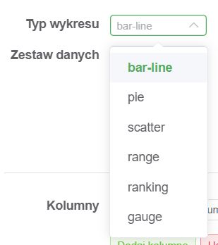
Bar-line (bar-line)
This chart type combines two forms of visualization: a bar chart and a line chart. It is used to display different types of data on the same chart, for example, sales volume (bars) and trends over time (line). It is ideal for comparing values across multiple data series.Pie (pie)
A pie chart presents data as a circle divided into sectors, where each sector represents the share of a category in the whole. It is excellent for showing proportions, such as the share of different products in total sales.Scatter (scatter)
A scatter plot visualizes the relationship between two variables. Data points are plotted on a coordinate system. It is particularly useful for correlation analysis, for example, between price and demand.Range (range)
A range chart illustrates data variability within a specified interval, such as minimum and maximum values. It can be used to show temperature ranges during a day or salary brackets within a professional group.Ranking (ranking)
This chart type displays data hierarchically, sorted from highest to lowest (or vice versa). It is useful for showing top performers in various categories, such as the best products ranking.Gauge (gauge)
A gauge chart resembles a clock dial and is used to show the level of a specific value relative to a defined range. It can be used, for example, to monitor progress toward a goal (e.g., 75% budget utilization).Data source:
2. Chart Axes:
Allows selecting the data source for the chart, which can be named freely (without spaces or Polish characters).
Note: By default, the names of predefined datasets are called "dataset."
“X-Axis Settings” allows full customization of the appearance and functionality of the X-axis on the chart. Below is a detailed description of the available options:
Show Axis
Toggle to enable or disable the visibility of the X-axis on the chart. When turned off, the X-axis will not be displayed.Font Size
The "+" and "–" sliders let you adjust the font size used on the X-axis (e.g., for labels).
You can precisely tailor the text size to suit your visualization needs.Axis Thickness
A slider to control the thickness of the X-axis line.
This allows adjusting the axis visibility depending on its importance in the chart.Axis Color
Color picker option to change the color of the X-axis line. Clicking the color box opens a color palette.Show Direction
Toggle to enable direction indicators (e.g., arrows at the ends of the axis).
Useful when the direction of data matters.Show Label Indicators
Enabling this option displays guide lines connecting labels to their points on the X-axis.
Helpful when labels are densely packed.Show Labels
Toggle to show or hide labels on the X-axis.
If labels are not needed, you can disable them for a cleaner chart appearance.Label Position
Dropdown menu to select the position of labels relative to the X-axis (e.g., above, below, or on the axis).
Allows precise control over text placement.Label Spacing
The "+" and "–" sliders control the spacing between consecutive labels on the X-axis.
Useful when dealing with large data sets to avoid label overlap.Leading Lines
Enabling this option displays lines leading from the axis to points on the chart.
This feature enhances data readability.
Y-Axis Settings allow detailed configuration of the Y-axis, enabling customization to suit visualization needs. Below is a detailed description of the available options:
Show Axis
Toggle to enable or disable the visibility of the Y-axis. If turned off, the Y-axis will not be displayed on the chart.Axis Type
Allows specifying the type of values on the Y-axis. For example:
Percentage: Data will be expressed as percentages.
Other options may include integers, continuous values, etc.
Value Range (Min./Max.)
Ability to manually set the minimum and maximum values on the Y-axis.
Values can be adjusted using the “+” and “–” buttons.Show Axis Line
Axis Name: You can assign a name to the Y-axis, which will be displayed on the chart.
Axis Thickness: Slider to adjust the thickness of the Y-axis line.
Axis Color: Option to change the axis line color using a color palette.
Axis Background: Choose from available background styles such as:
“No background” – axis without fill.
“Stripes” – alternating stripes appear in the background.
“Grid lines” – displays a grid to aid data visualization.
Line Style: Choose between solid and dashed lines.
Show Direction
Toggle to enable arrows indicating the direction of the Y-axis.Show Label Indicators
Number of Labels on Axis: Specify how many labels should be displayed on the Y-axis.
Spacing Between Labels: Adjust the distance between consecutive labels.
Distance from Axis: Set the distance of labels from the Y-axis line.
Value Rounding: Round values to a specified number of decimal places.
Font Size: “+” and “–” sliders to adjust the label font size.
Hard Limits
Hard Min./Max.: Set boundary values that data cannot exceed. Useful for dynamic data.
Additional Lines
The Add Line option allows adding extra guide lines (e.g., reference lines) on the Y-axis.
Returning to general chart editor functions:
Style and Legend:
Chart style settings (e.g., colors, line formats) can be customized via a dropdown menu.
Legend position (“bottom”) and additional display options are available in the Legend section.
“More Settings” button
Provides additional configuration options.Columns:
Column Filter:
Two selection options:“Only the following columns” – include selected columns only.
“All columns except the following” – exclude specified columns from the chart.
Add/Remove Columns:
Add Column: Allows adding selected data.
Remove All Columns: Clears existing data.
Show Gaps Between Groups:
Toggle visualization of gaps between data groups.Data Series:
Series:
List of data series used in the chart.
You can add new data series via the Add Series option or check data sources with Check Sources.Bar Width:
“Automatic” adjusts bar width dynamically.
“Fixed” allows manual width setting.
Series Overlap:
Slider to control overlapping of data series on the chart for better visualization.Spacing:
Slider to adjust spacing between chart elements, e.g., bars.Additional Options:
Swap Rows and Columns:
Function to swap rows and columns for better data organization.Action Icons:
Options to manage data series, such as detailed settings, visibility in the legend, or deleting a selected series.Save and Cancel Changes:
Save: Confirms all changes made.
Cancel: Discards changes and restores previous configuration.
Understanding these functions will allow you to create a report from scratch. If you encounter difficulties despite the instructions, please contact us!